:format(webp):upscale()/http%3A%2F%2Fstorage.canalblog.com%2F77%2F62%2F277354%2F127204411_o.jpg)
:format(webp):upscale()/http%3A%2F%2Fstorage.canalblog.com%2F54%2F22%2F277354%2F127210156_o.jpg)
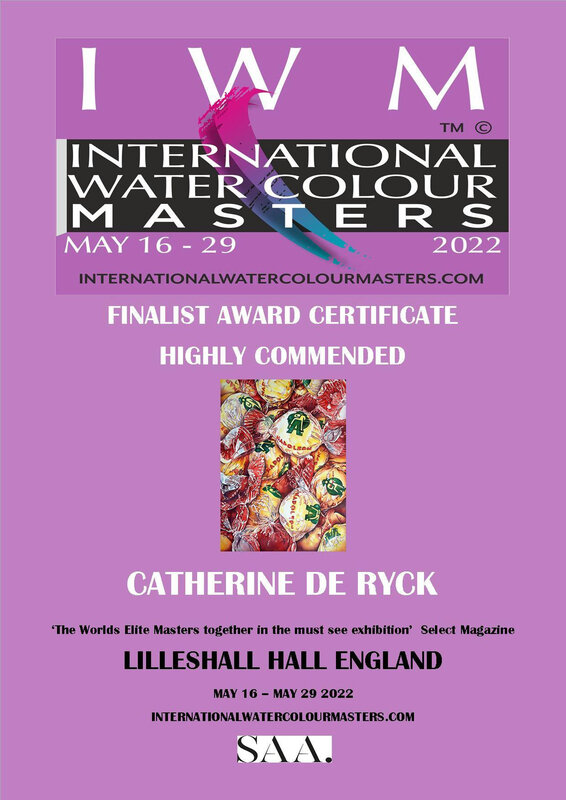
Expositions / Exhibitions 2023
Exposition des élèves et professeurs de l'Ecole d'Aquarelle Namuroise, du 25 mai au 10 juin. Galerie du Beffroi, rue du Beffroi 13, 5000 Namur.
Aquareliège, du 17 au 20 août. Musée de la Boverie, Parc de la Boverie, 4020 Liège, Belgique. aquareliege.com.
51è Exposition de la Saint-Barthélémy, du 24 au 27 août. Salle Gossiaux, Place de la Gare, Avenue des Combattants, 1470 Bousval, Belgique.
Watercolor International VI, à partir du 26 septembre à la Galerie EMS (Galerie d'Art de la Société d'Etudes Macédoniennes) à Thessalonique, Grèce. Curateur de l'exposition : George Politis.
Exhibition of the students and professors from the Ecole d'Aquarelle Namuroise, from May, 25 until June, 10. Galerie du Beffroi, Belfort Street 13, 5000 Namur.
Aquareliège, August, 17 - 20. La Boverie Museum, Parc de la Boverie, 4020 Liege, Belgium. aquareliege.com.
51th Exhibition of Saint-Barthélémy, August, 24 - 27. Salle Gossiaux, Place de la Gare, Avenue des Combattants, 1470 Bousval, Belgium.
Watercolor International VI, from September 26, at the EMS Gallery (Gallery of the Society of Macedonian Studies) in Thessaloniki, Greece. Exhibition Curator: George Politis.