
Les clés du Négatif / The keys to Negative Painting
Voici quelques clés pour une Peinture en Négatif couronnée de succès :
- Prenez le temps de visualiser votre sujet avant de commencer à peindre.
- Choisissez votre papier : optez pour un papier pressé à froid, 100% coton, "Cold Pressed" ou "NOT" et évitez les papiers "HP" ou "Hot Pressed". Ceux-ci sont généralement enduits par une couche de glycérine qui rend leurs fibres résistantes à l'absorption de la couleur. Etant donné que la Peinture en Négatif implique l'application de lavis successifs, le papier pressé à froid est plus approprié car les couleurs préalablement posées ne se déchausseront pas sous l'effet de l'eau.
- Appliquez vos couleurs dans un ordre précis, en fonction de leur mobilité et imprégnation du support : d'abord les Teintures, puis les Sédimentaires et enfin les Minérales. De cette manière, vous éviterez toute saturation et protégerez les couleurs les plus fragiles dans le temps.
- Comme pour toute aquarelle, commencez par les couleurs les plus claires et les plus chaudes.
- Dégradez vos couleurs pour plus de vie et de vibration.
- Travaillez de l'avant-plan vers l'arrière-plan.
- Laissez sécher chaque glacis avant d'appliquer le suivant.
- Pensez en termes de formes qui entourent votre sujet plutôt qu'au sujet lui-même, cela confèrera davantage de spontanéité et de symboles personnels à votre travail.
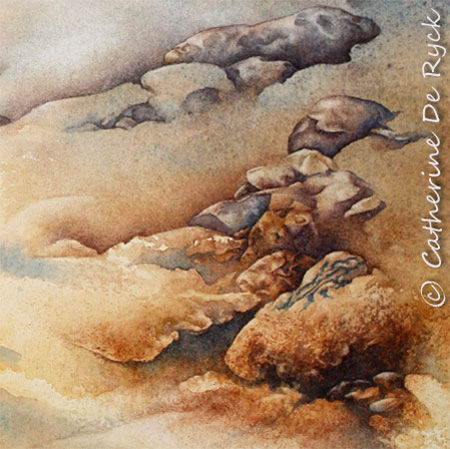
Façonnements, détail / detail. Aquarelle / Watercolour. 2009.
Here are some keys for a successful Negative Painting :
-
Take the time to visualize your subject before starting to paint.
-
Choose your paper : opt for a cold pressed paper, 100% cotton, "CP" or "NOT" and avoid all "HP" or Hot Pressed papers. These are generally coated with glycerine, which renders their fibers resistant to paint absorption. In other words, the paint will stay on the surface. As Negative Painting implies the application of successive layers, cold pressed paper is more appropriate because the colours previously laid down will not move under the effect of water.
-
Apply your colours by following a precise order, according to their mobility and impregnation of the support : begin with the Staining, then the Sedimentary and finally the Mineral pigments. This way, you will prevent your work from saturation and protect the most fugitive of your colours in term of time-preservation.
-
As for any watercolour, begin with the lightest and warmest colours.
-
Create shaded tones for a vibrant and living painting.
-
Work from the foreground to the background.
-
Allow each layer to dry before applying the next glaze.
-
Think in terms of shapes around your subject rather than in the subject itself, this will bring more spontaneity and personal symbols to your work.


/https%3A%2F%2Fassets.over-blog.com%2Ft%2Fcedistic%2Fcamera.png)
/http%3A%2F%2Fstorage.canalblog.com%2F33%2F70%2F277354%2F128164662_o.jpg)
/http%3A%2F%2Fstorage.canalblog.com%2F07%2F18%2F277354%2F128164758_o.jpg)
/http%3A%2F%2Fstorage.canalblog.com%2F36%2F98%2F277354%2F128164684_o.jpg)